Aircraft maintenance delays cost thousands of euros per hour. Planning Direction department needed real-time visibility into maintenance progress across 5 global facilities.
Critical Issues:
❌ Excel spreadsheet chaos - progress data scattered across multiple files with no real-time updates
❌ Physical distance - Planning dept located 5-minute walk from maintenance lines
❌ Manual status checks - employees walked to maintenance floors to check whiteboards or ask mechanics directly
❌ No centralized overview - impossible to see global progress at a glance
❌ Delayed stakeholder communication - couldn't quickly inform clients about delays
Business Impact: Time wasted on status checks = delayed decision-making = cascading maintenance delays = thousands in costs

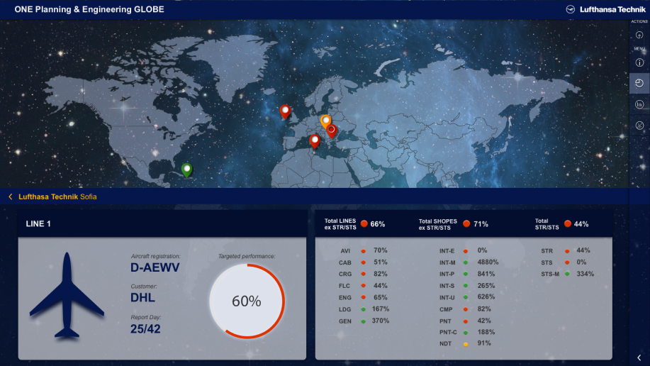
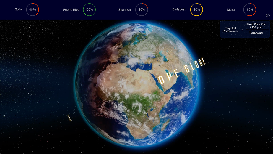
Real-Time Dashboard for 70"+ TV DisplayDesigned centralized monitoring system showing progress across all 5 maintenance facilities simultaneously.
Key Design Decisions:
✅ Always-visible progress bars (5 locations)
✅ Traffic light color system (Red/Yellow/Green)
✅ 3-click maximum depth

✅ Bottom-aligned navigation (Critical iteration)
Complex Data Handling:
✅ Solved edge case: Some shops showed >100% progress
Stakeholder Communication:
✅ Responsible for both design AND business liaison:

Efficiency Gains:
✅ Exceeded 80% target goal - saving 6 hours per month per employee across 96 global staff (576 hours/month saved)
Operational Improvements:
✅ Real-time delay visibility enables faster stakeholder communication
✅ Centralized dashboard eliminated Excel spreadsheet chaos
✅ Single source of truth for global maintenance progressDesign Validation:
✅ On-site testing prevented major usability failure (navigation height)
✅ 3-click information access validated by user testing
✅ Traffic light system proved instantly understandable with zero training
Key Insight
High-density data visualization for mission-critical contexts requires deep domain understanding and real-environment testing. The navigation repositioning - discovered only when testing on actual 70" hardware - demonstrates why "test early, test often, test in context" isn't just a principle, it's essential. A dashboard that looks perfect on a laptop can be completely unusable at 170cm height.

"She showcased exceptional talent and expertise in UX design. Ana's contributions were instrumental in shaping the user experience and final design for user experiences supported by real estate investment analytics and machine learning algorithms."

Product owner @ Mashvisor
Having Sia as the UX design expert in the team has turned out to be one of the key factors behind the success story of the project.
With an in-depth understanding of the client's business processes, she not only designed a modern-looking user interface for the applications, but actually streamlined user journeys, made interaction with the systems much more intuitive and helped eliminate human errors in data input.

Lead Architect @ OneBit Software