Old legacy system processing critical governmentbilling for millions of citizens had systematic usability failures
Critical Issues:
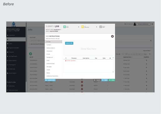
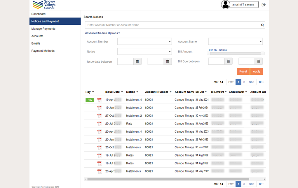
❌ Modal overload - 70+ form fields crammed into small modal window with misleading "3 steps" label hiding 13 tabs
❌ No save mechanism - exiting modal before completion = all work lost
❌ Database-first structure - fields ordered by backend logic, not user mental models (e.g., critical date fields buried in tab 11 of 13)
❌ Zero collaboration support - no way for team members to resume work on partially completed Jobs
❌ High error rates - incomplete submissions, missed required fields, Jobs constantly bounced back for corrections
Business Impact: Each error affects hundreds of thousands of citizens receiving incorrect billing notices. Time-sensitive deadlines mean mistakes cascade into systemic failures."The interface actively fought against how people actually work" — Project Manager, FormsExpress
Phase 1: Research & Discovery (1 month)
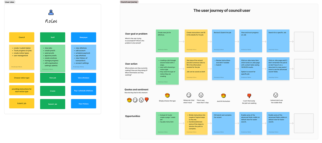
Phase 2: Council User Flow RedesignJob Submission Transformation:
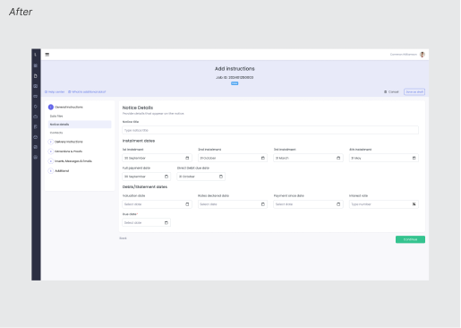
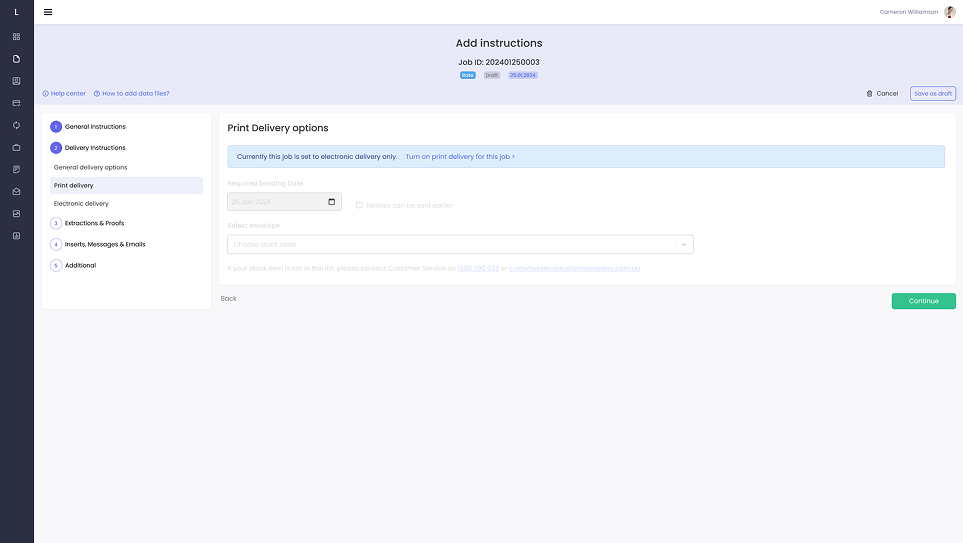
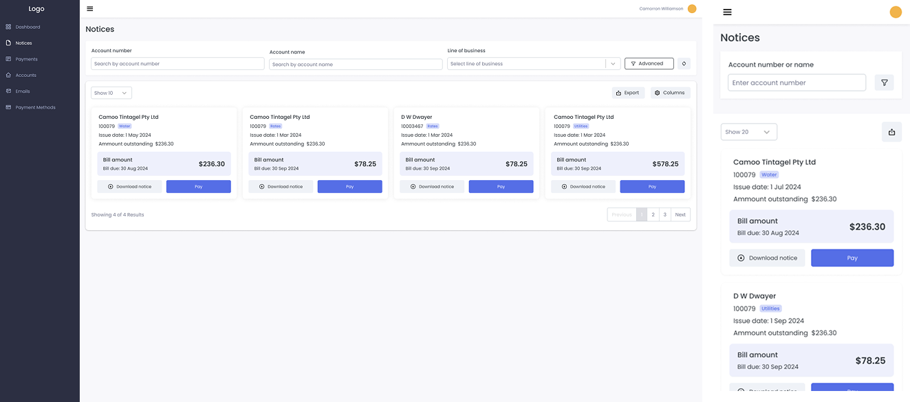
✅ Full-screen stepped progression (eliminated cramped modal)
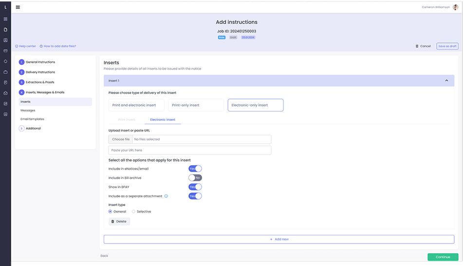
✅ Conditional field logic - users see only relevant options (70+ fields → 20-30 per scenario)
✅ Auto-save draft system (backend change I proposed) - enables pause/resume workflow
✅ "My Jobs" dashboard for team collaboration and easy Job discovery
Mental Model-Driven Structure:
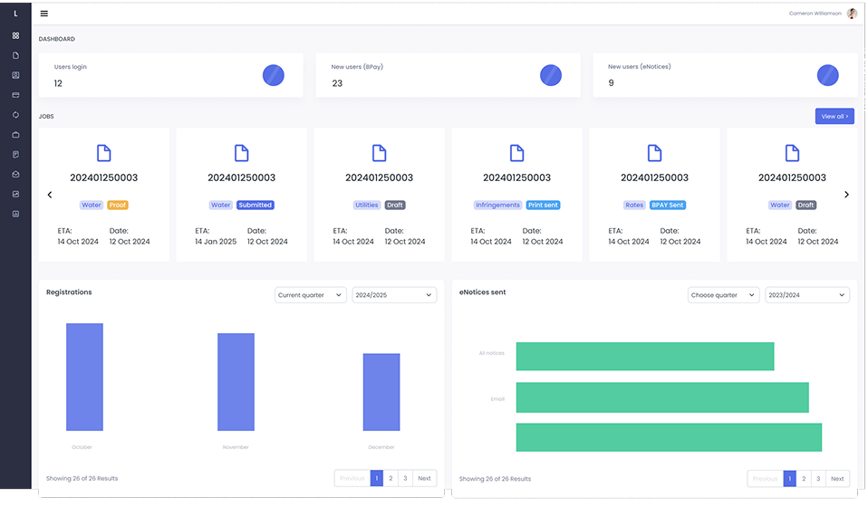
Phase 3: Internal Team WorkflowProcess Automation:
Phase 4: System Design
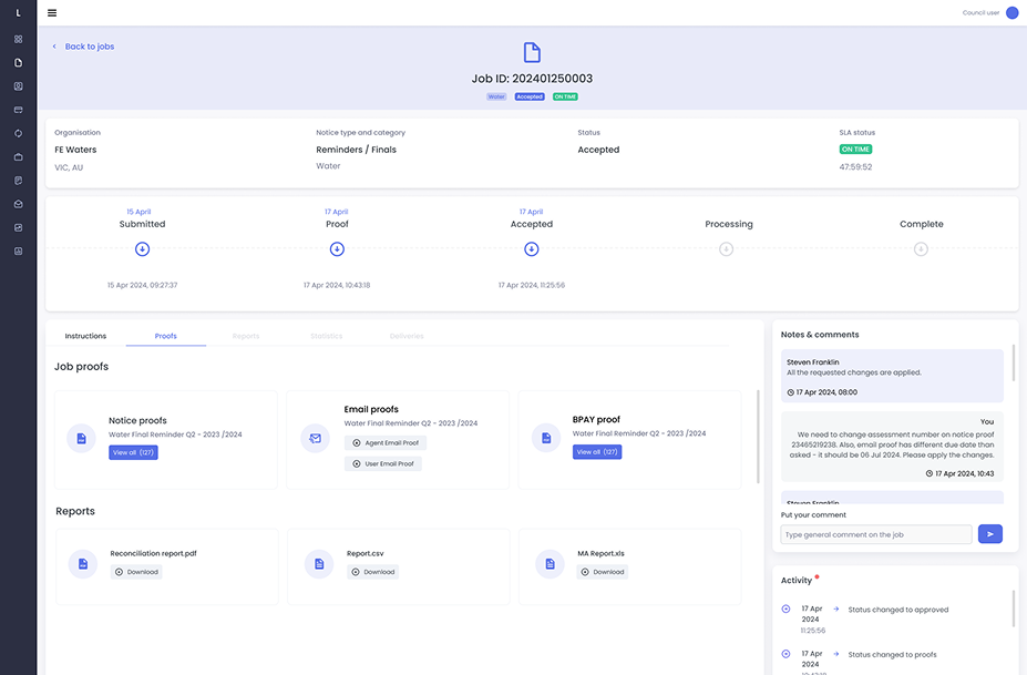
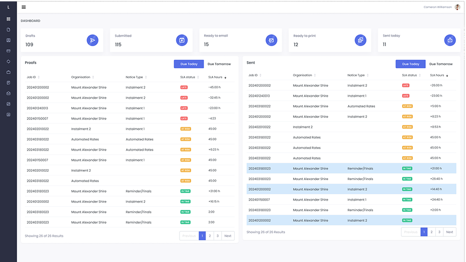
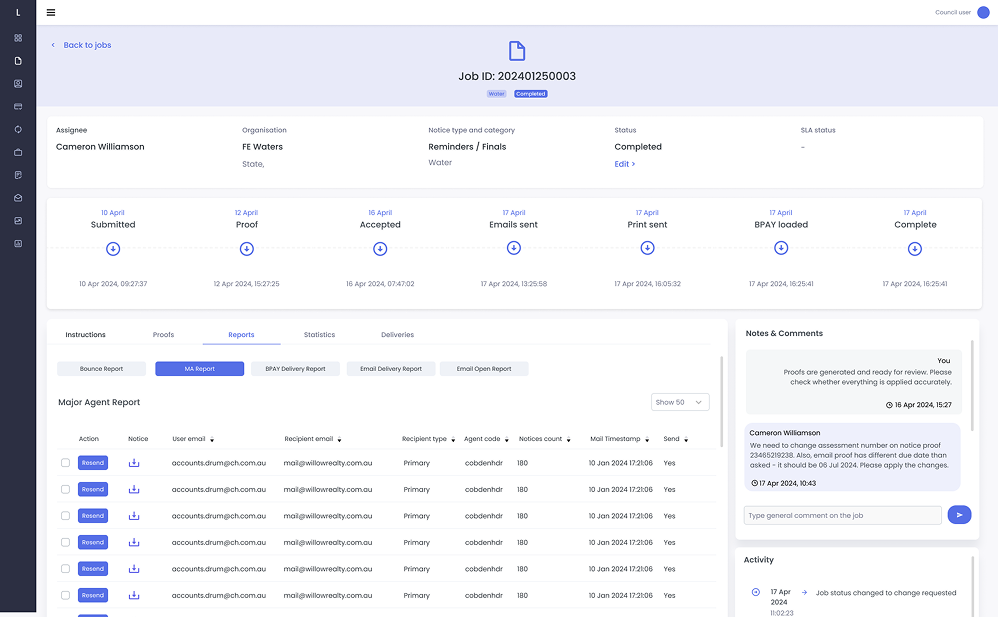
Error Elimination:
Efficiency Gains:
System Success:
Enterprise UX isn't about aesthetics - it's about preventing costly mistakes at scale. When millions of citizens depend on accurate billing, restructuring workflows around human cognition (not database architecture) becomes mission-critical. Sometimes the best UX solution requires changing the backend - advocating for the draft auto-save system wasn't originally scoped, but was essential to solving the real problem.

"She showcased exceptional talent and expertise in UX design. Ana's contributions were instrumental in shaping the user experience and final design for user experiences supported by real estate investment analytics and machine learning algorithms."

Product owner @ Mashvisor
Having Sia as the UX design expert in the team has turned out to be one of the key factors behind the success story of the project.
With an in-depth understanding of the client's business processes, she not only designed a modern-looking user interface for the applications, but actually streamlined user journeys, made interaction with the systems much more intuitive and helped eliminate human errors in data input.

Lead Architect @ OneBit Software
Open to Senior Product Designer roles in enterprise SaaS.

